How I design meeting posters that people actually save
The visual thinking behind the Milpitas MUN Instagram campaign — and what makes a graphic stop the scroll instead of disappearing into it.
The first MUN poster I made looked like most school club posters: text on a background, club name at the top, meeting details in the middle, posted and promptly forgotten. It did its job technically. Nobody saved it.
I started thinking about what actually makes someone stop scrolling on Instagram. Not click-through rates or engagement metrics — just the pure question of what makes a graphic register as worth pausing on.
What I found, through watching my own behavior and everyone else's: people stop for things that look like they were made by someone who cared. Not professionally produced. Not expensive. Just: someone chose these specific elements, arranged them this way, for a reason that wasn't accidental.
So I rebuilt the MUN visual system around that principle.
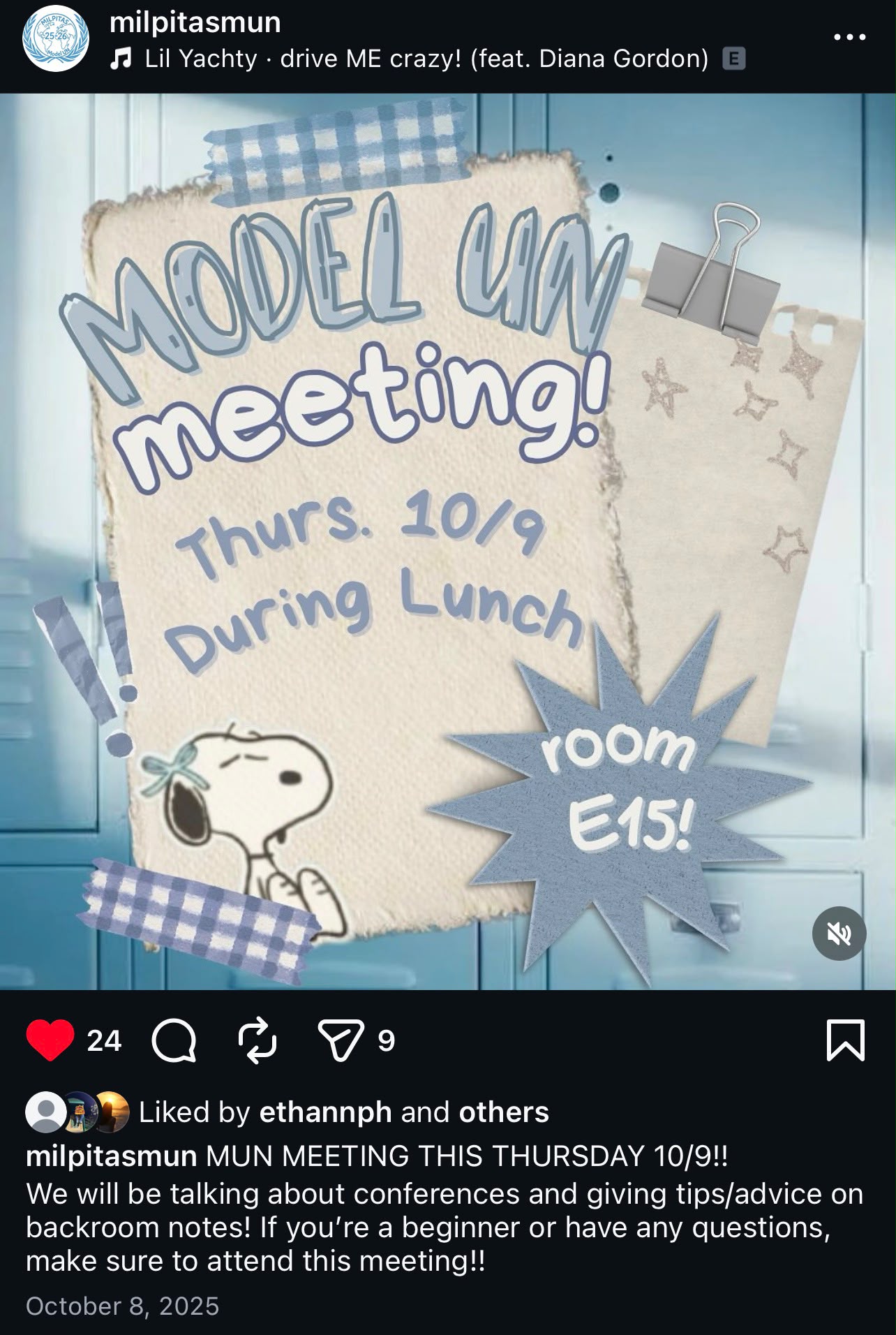
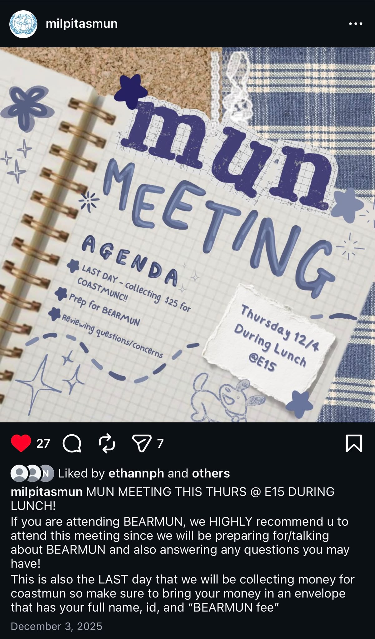
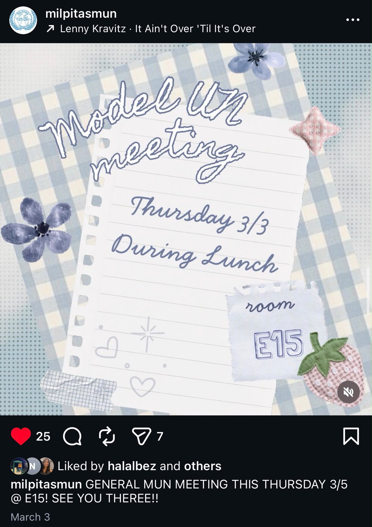
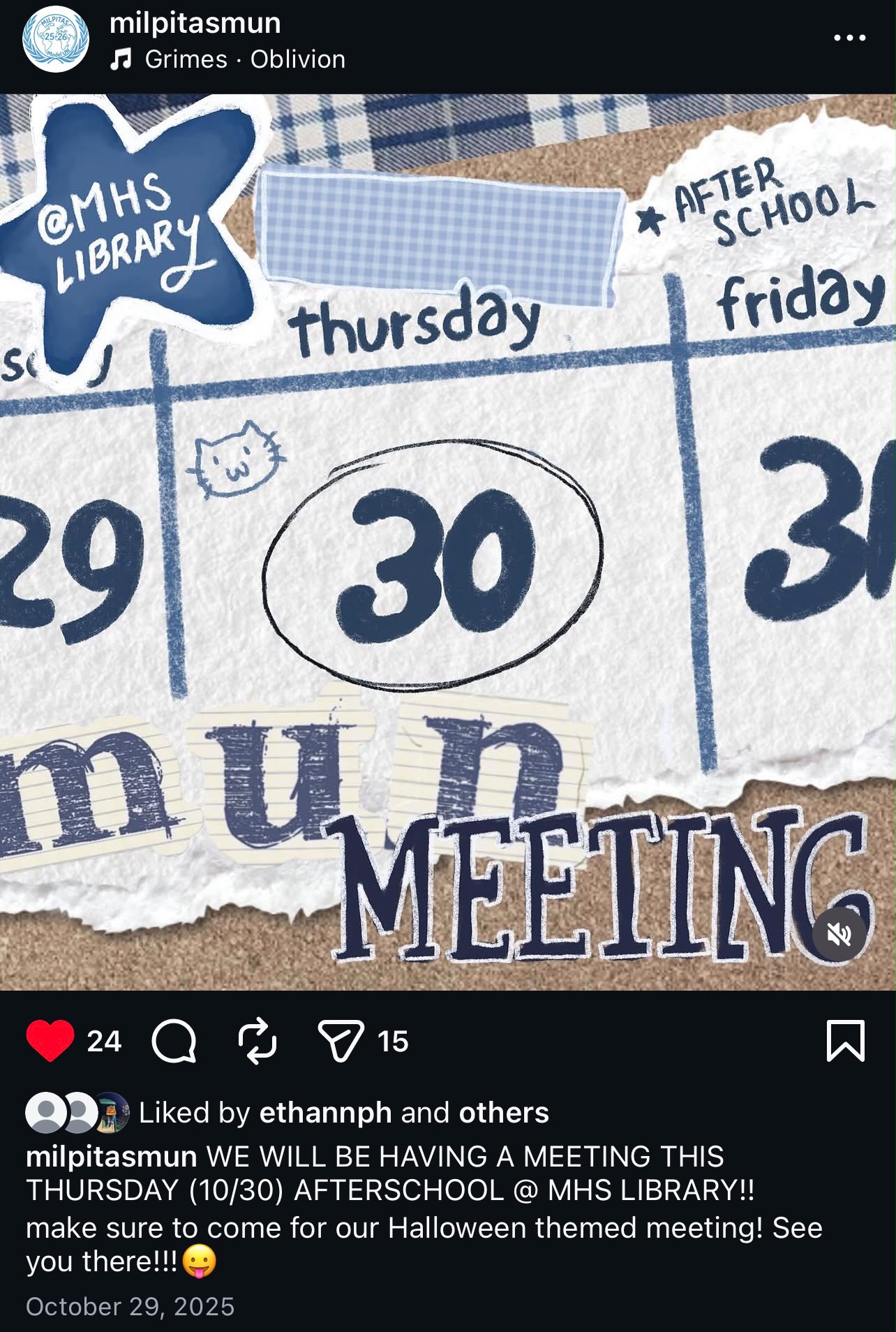
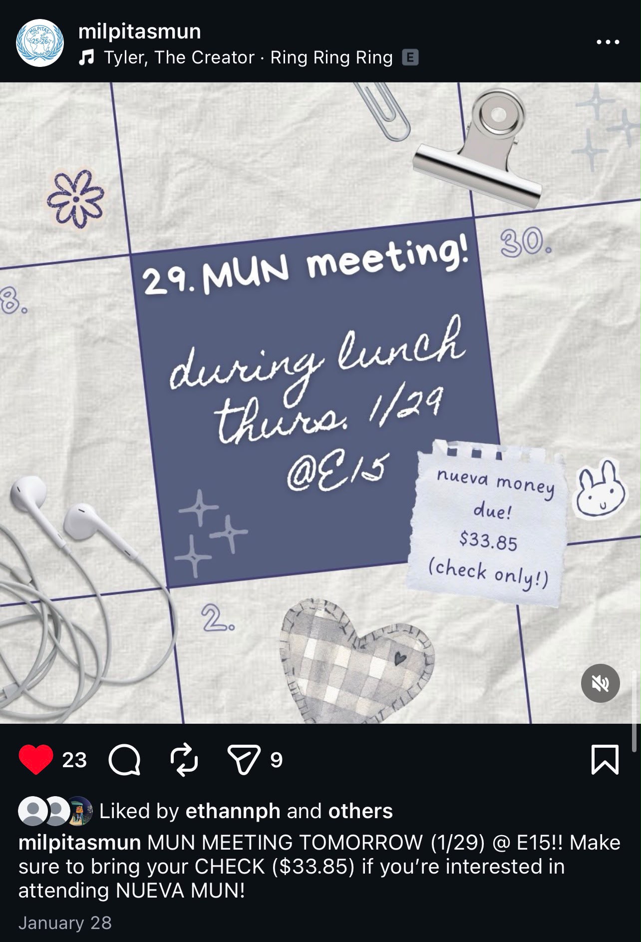
The scrapbook/collage aesthetic wasn't arbitrary. It comes from the actual experience of being in Model UN — the notebooks filled with research, the papers covered in handwritten notes, the physical texture of preparation. The gingham tape and ripped paper edges and halftone textures are visual shorthand for that experience. Members recognize it because they've lived it.
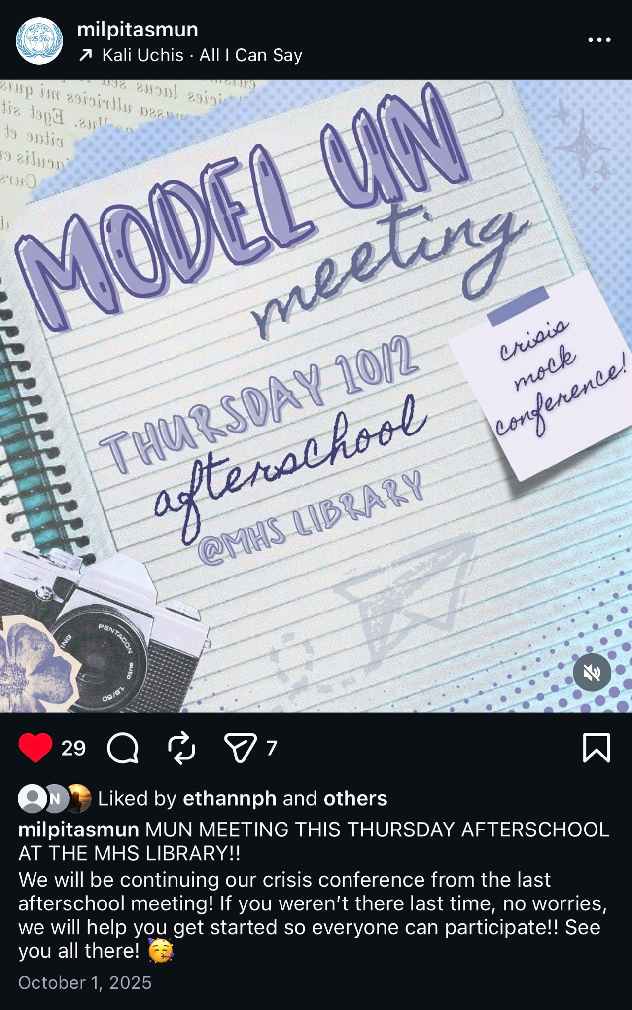
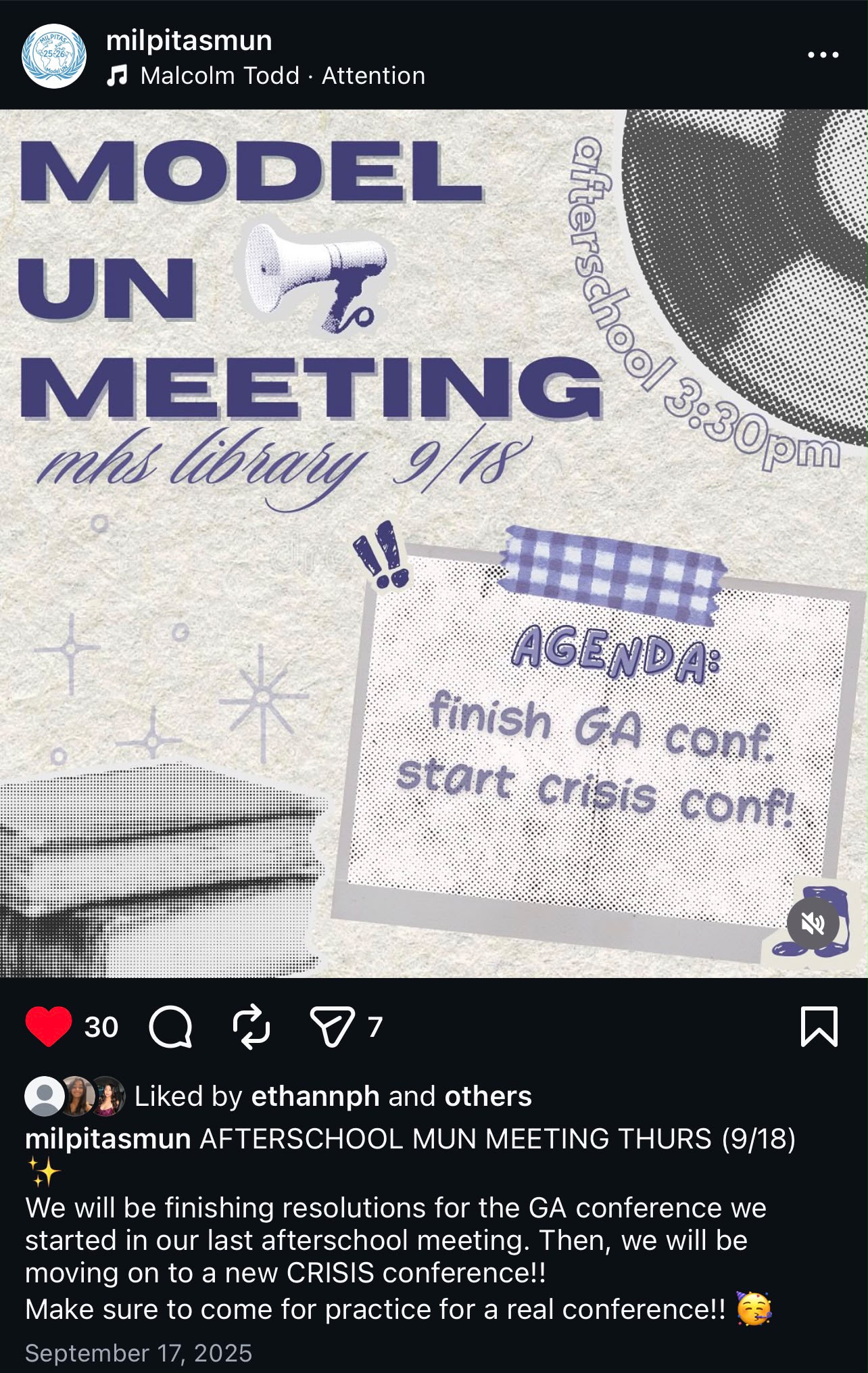
The typography collision — heavy block type for "MODEL UN MEETING" paired with delicate cursive for the location — is a deliberate tension. It says: this is serious (block) and warm (cursive) at the same time. Those aren't contradictory qualities in a student organization.
Every poster in the series has a slightly different energy, which keeps the feed from feeling templated while staying visually coherent. The color palette (deep navy, soft gingham blue, warm paper) is the constant. The typographic approach shifts per meeting to reflect the agenda's tone — a crisis conference gets something more urgent than a regular meeting announcement.
Here's the practical insight I've taken from this: design for the collection, not just the individual post. A single great poster is nice. Seven posters that are individually interesting and collectively coherent is a brand. The community starts to trust that whatever shows up from the account will be worth looking at.
That trust is what eventually creates a culture where people save the graphic and show up to the meeting.
Selected pieces