Designing for a club is designing for belonging
What the Leo Club illustrated brand system taught me: the real job of a community graphic is to make someone feel like they already belong before they've walked in the door.
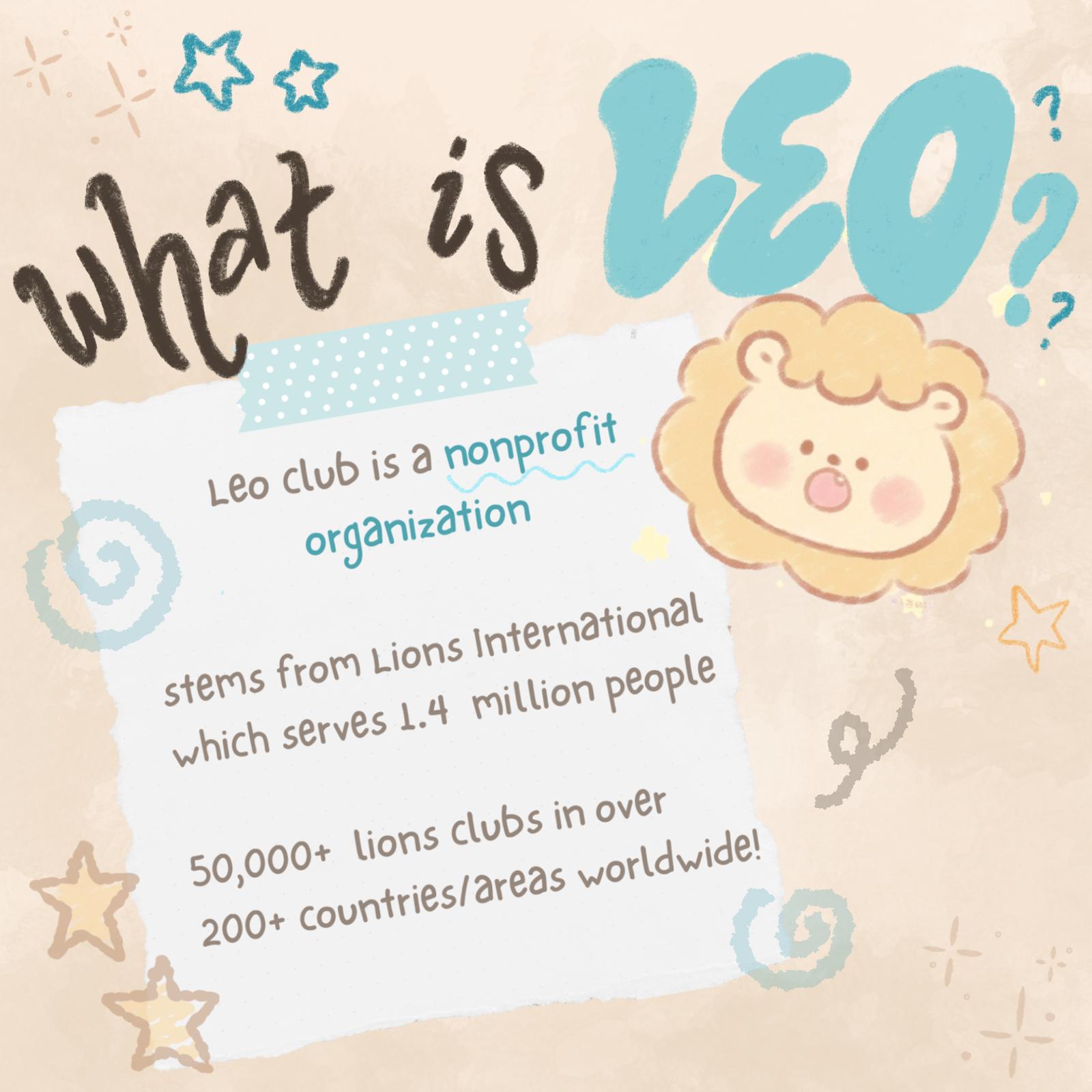
There's a design problem that's smaller than saving a life and bigger than it looks: making a high school club feel like somewhere you'd actually want to be.
When I started working on the Leo Club brand system, the brief was essentially: tell people what Leo Club is and why they should join. Four slides. Instagram format. Make it look good.
What I realized, pretty quickly, was that "make it look good" was the wrong goal. The right goal was: make it feel like you already belong there.
This is a meaningful difference. "Looking good" is about aesthetics. "Feeling like you belong" is about recognition — the sense that the thing you're looking at was made for someone like you, and that when you show up, you'll be welcomed.
I started with the lion.
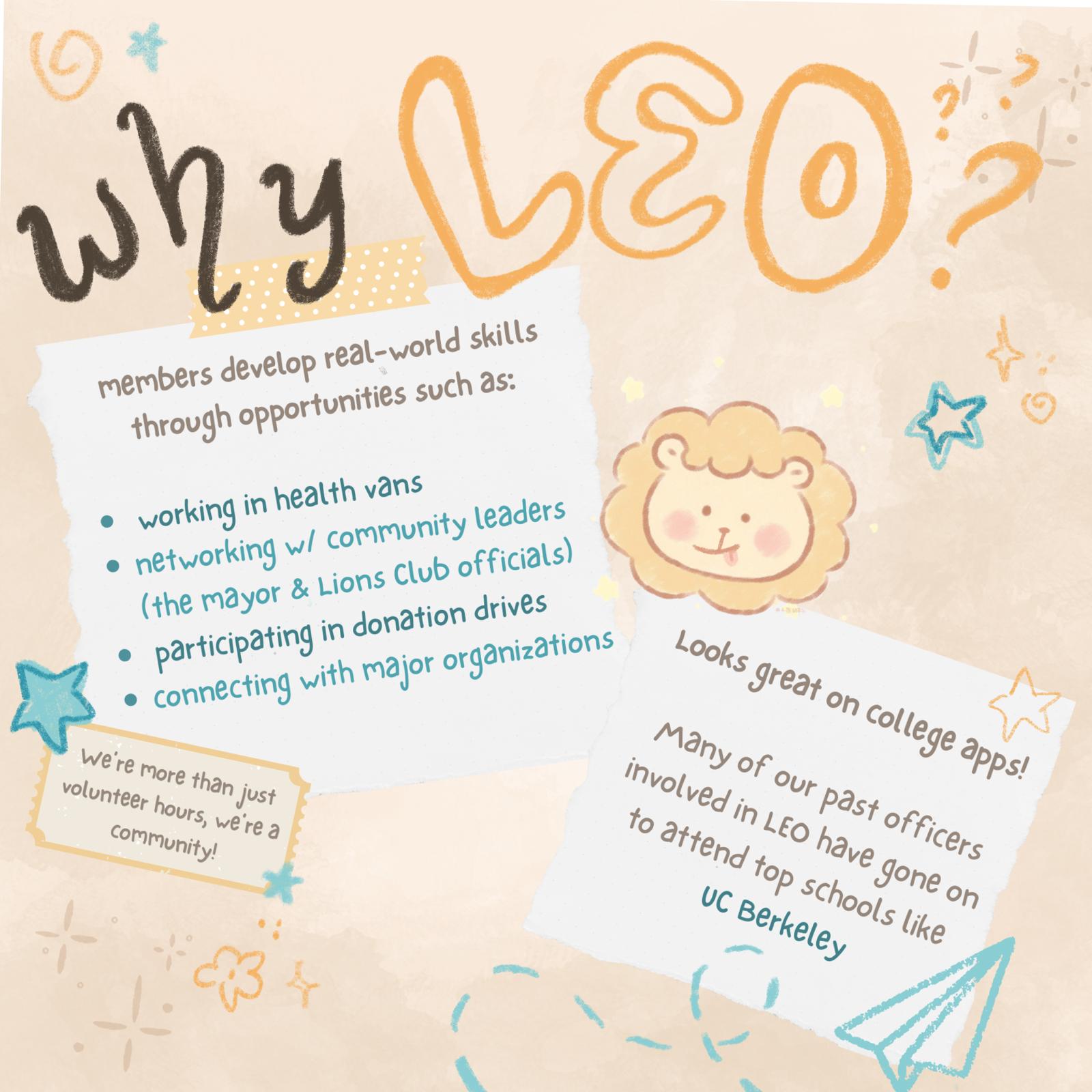
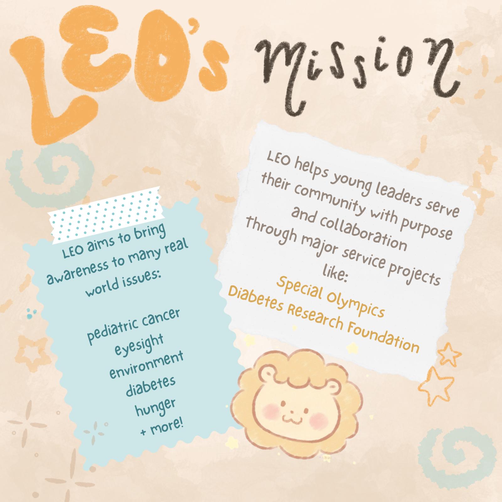
Not the logistics of Leo Club. Not the benefits. Not the alumni who went to UC Berkeley. The lion — drawn by hand in Procreate, round-faced and waving, with rosy cheeks and a tiny heart on its paw. Kawaii illustration conventions exist specifically for this: to signal warmth, approachability, and friendliness at a glance. The art style makes a promise about the community before a word has been read.
The color palette made the same promise. Warm beige is literally the color of a comfortable room. Teal and golden orange have energy without aggression. There's nothing in the palette that says "you have to prove yourself here."
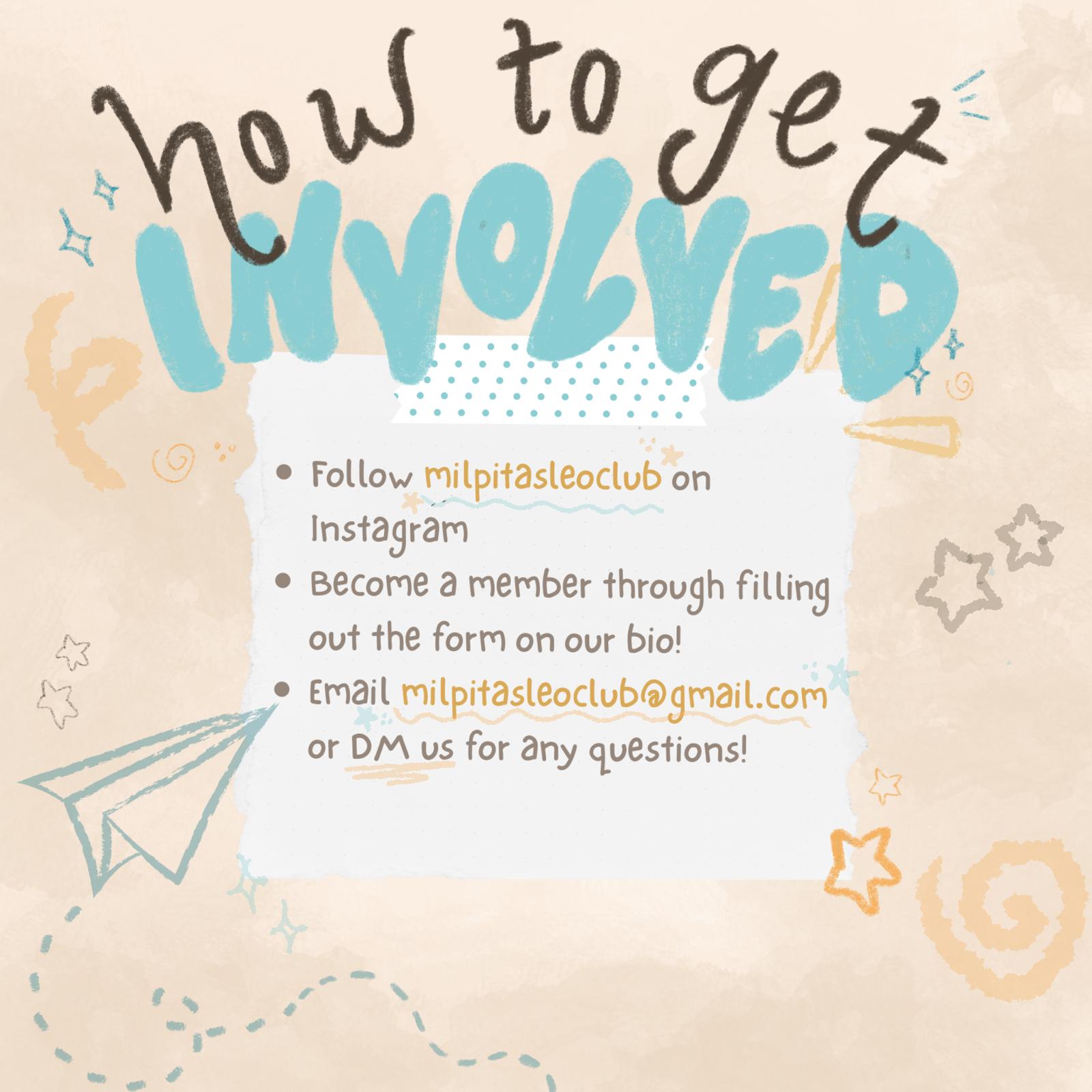
Only after establishing that emotional register did I introduce the information: Leo Club is a nonprofit. Lions International. 50,000 clubs worldwide. Here's what members actually do. Here's why it matters. Here's how to join.
The structure mirrors the experience of being recruited well: first you feel welcome, then you learn what you're getting into.
Graphic design for community organizations is, at its core, the design of an invitation. The question isn't "does this look impressive" — it's "does this make someone feel like they're invited in?" Those two things are not the same, and prioritizing the wrong one produces graphics that look great and rooms that stay empty.
Selected pieces